
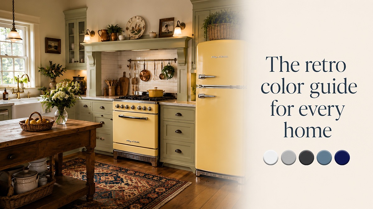
The retro color guide for every home
The Kitchen Obsession guide to integrating color into your kitchen
The boring limitations of black, white, or stainless
Over the past couple of decades, appliance color choices have been limited to white, black, and stainless steel. Those finishes fit a wide range of styles and tastes, but they do not suit every kitchen or every homeowner.
In a typical home kitchen, the visual king of the castle is the refrigerator. A close second is the range-and-hood combination. Together, they take up the bulk of a kitchen’s visual space.
Make a style choice: let those appliances lead the way or allow them to sink into the background. With their sheer size, appliances can become the defining features of the space. Or they can simply be large blocks of black, white, or stainless steel nestled among cabinetry.
Big Chill’s Retro Collection gives homeowners another option by combining the rounded forms and chrome details of early- and midcentury appliances with a selection of colors rarely found in standard appliance lines today.
Kitchen Obsession currently lists seven standard Retro colors:

Beach Blue, Classic White, Cherry Red, Jadite Green, Buttercup Yellos, Turquoise, and Pink Lemonade.
Six premium colors

Black, Orange, Carmine Red, Moss Green, Signal Blue, and Grey White
and more than200 custom color options further expand the range.
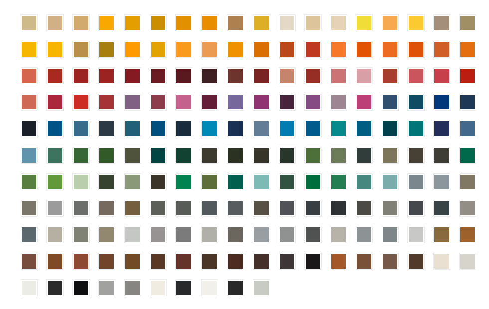
How to use this color guide
For each color, consider four questions:- What role should the appliance play? The appliance can become the kitchen’s focal point, support the surrounding color palette, or quietly complement the architecture.
- What materials already dominate the room? Wood species, stone, tile, flooring, cabinet paint, and metal finishes all affect how an appliance’s color appears.
- What kind of light reaches the kitchen? North-facing daylight, direct southern sun, warm bulbs, and cool LEDs can make the same finish appear noticeably different.
- Does the color fit the house as a whole? A kitchen should have its own character, but it should not feel unrelated to the surrounding rooms.
1. Beach Blue
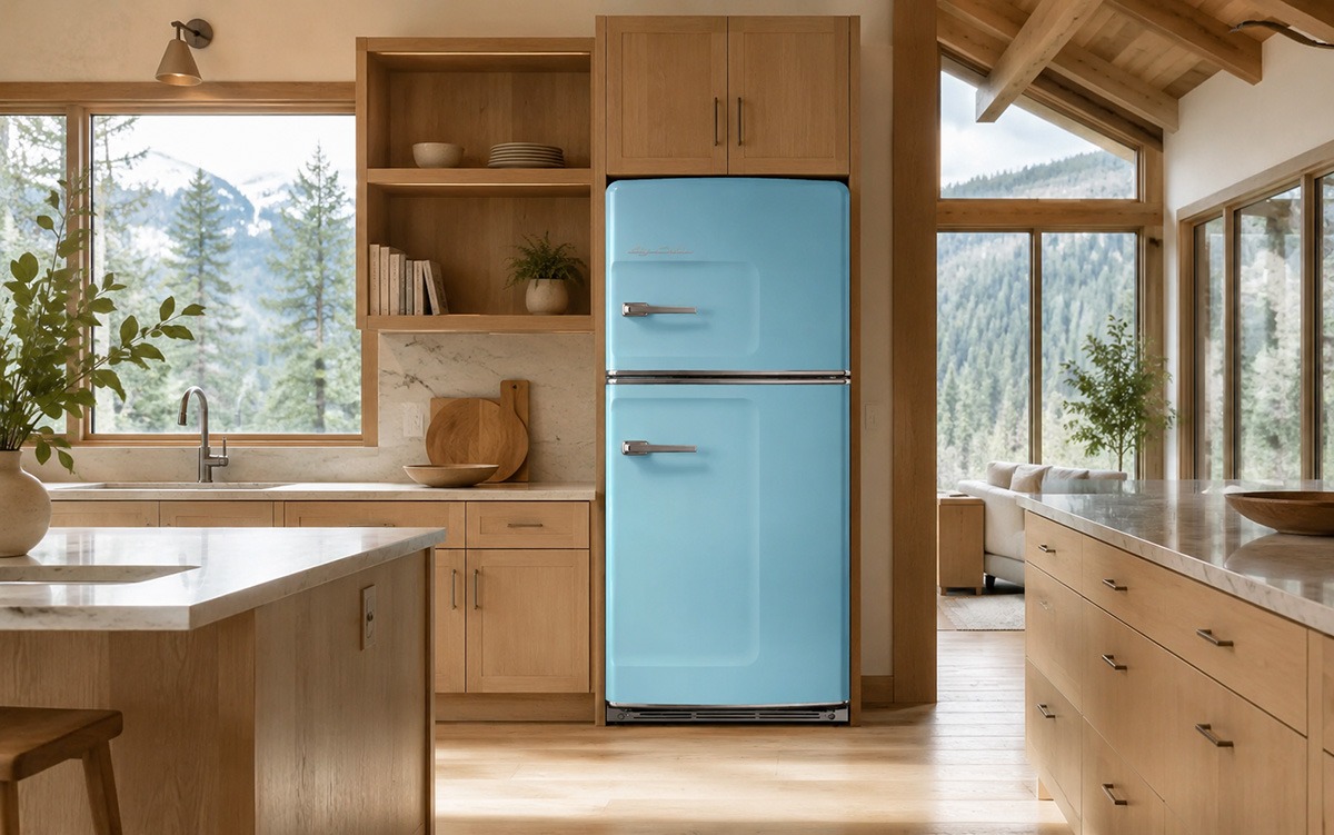
Approximate digital color: #7FC8E6
Beach Blue is a light, cool blue with a relaxed character. It carries an obvious coastal association, but it is not limited to beach houses.
In darker kitchens, Beach Blue can introduce visual lightness. In rooms with white or pale cabinetry, it creates a soft color contrast without dominating the space. Against darker cabinets, it becomes brighter and more graphic.
Home styles that suit Beach Blue
Beach Blue works particularly well in:
- Coastal homes and beach cottages
- Light farmhouse kitchens
- Scandinavian-influenced interiors
- Contemporary kitchens with pale wood
- Traditional cottages
- Vacation homes
- Cabins with dark pine, cedar, or timber walls
In a cabin, it can relieve the visual weight of heavy wood. In a suburban or contemporary kitchen, it can add personality to otherwise neutral cabinetry. In a coastal home, it supports the setting without requiring obvious nautical decoration.
Cabinets and wood
Beach Blue pairs well with natural white oak, maple, birch, light hickory, and lightly stained pine. White and cream cabinets create a fresh appearance, while navy or charcoal cabinets create a stronger contrast.
It also works with darker wood, particularly when the room needs a lighter focal point.
Counters and stone
Consider:
- Honed soapstone
- Charcoal granite
- White or pale gray quartzite
- Light terrazzo
- Marble or marble-look quartz
- Soft gray concrete
Darker counters ground the pastel finish. Pale stone keeps the room airy.
Metals
Chrome and polished nickel reinforce the appliance’s retro character. Brushed nickel creates a quieter transition. Zinc and pewter-toned finishes can make the room feel less polished and more casual.
Lighting
Strong natural daylight can make Beach Blue appear cooler. Warm task lighting in the 2700K to 3000K range can keep it from looking icy.
2. Buttercup Yellow
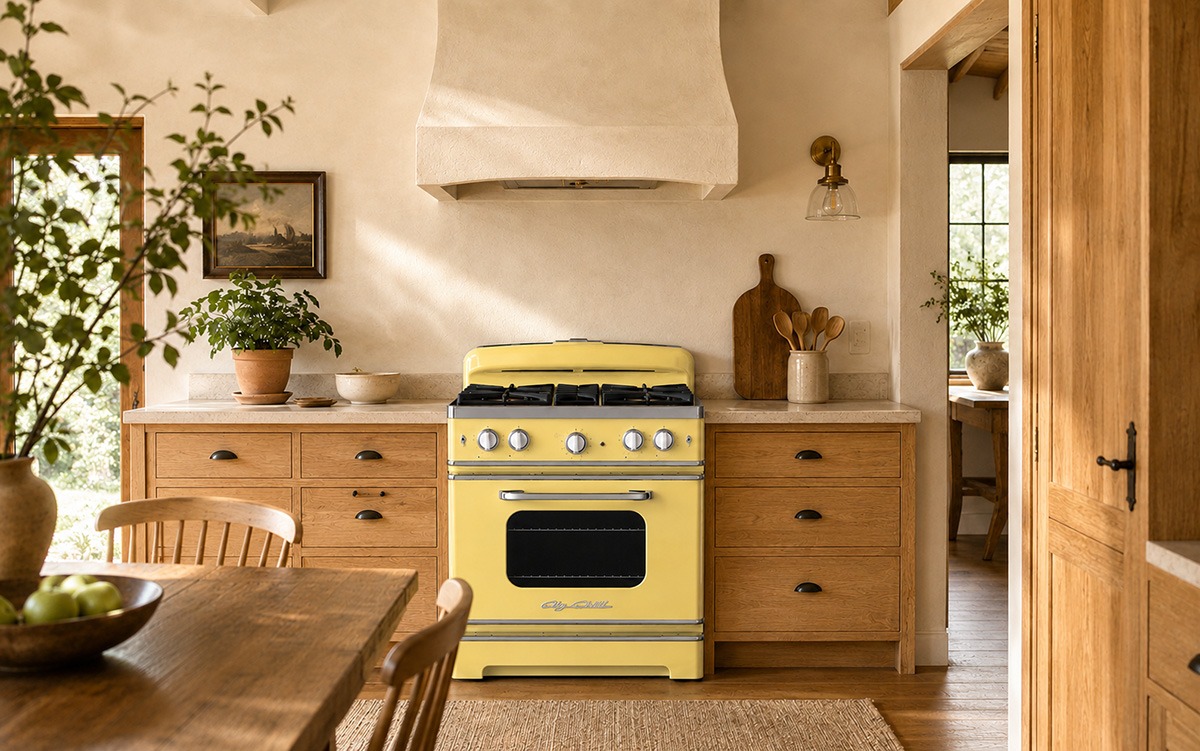
Approximate digital color: #F2D35A
Buttercup Yellow is warm, welcoming, and familiar. It suggests vintage kitchens, painted farmhouse furniture, pottery, and sunlit interiors without becoming fluorescent or overly bright.
Yellow naturally draws attention, but Buttercup is soft enough to coexist with substantial wood grain, patterned tile, and traditional finishes.
Home styles that suit Buttercup Yellow
Buttercup works well in:
- Farmhouses
- Craftsman homes
- Traditional cottages
- Historic kitchens
- Country homes
- Eclectic interiors
- Midcentury houses
- Rustic and timber-frame homes
It can give a newly built kitchen a sense of age and familiarity. In an older home, it can feel respectful of the architecture without attempting an exact period reproduction.
Cabinets and wood
Buttercup Yellow complements Douglas fir, heart pine, natural oak, warm maple, walnut, and medium-stained hickory.
Cream cabinets create a gentle, traditional palette. Green, blue, and charcoal cabinets provide more contrast. Avoid surrounding it with too many competing yellow-toned woods unless the room has enough neutral material to separate them.
Counters and stone
Consider:>
- Warm soapstone
- Fieldstone
- Travertine
- Honed limestone
- Cream or honey-veined quartzite
- Brick
- Warm white quartz
- Handmade tile in cream, green, or muted blue
Metals
Brushed brass and aged brass emphasize warmth. Blackened iron suits farmhouse, Craftsman, and rustic interiors. Nickel can keep the color from feeling too traditional.
Lighting
Warm bulbs deepen the yellow and can make the kitchen feel especially comfortable at night. In rooms with warm cabinets and floors, use neutral task lighting around food-preparation areas to prevent the entire room from becoming overly golden.
3. Cherry Red
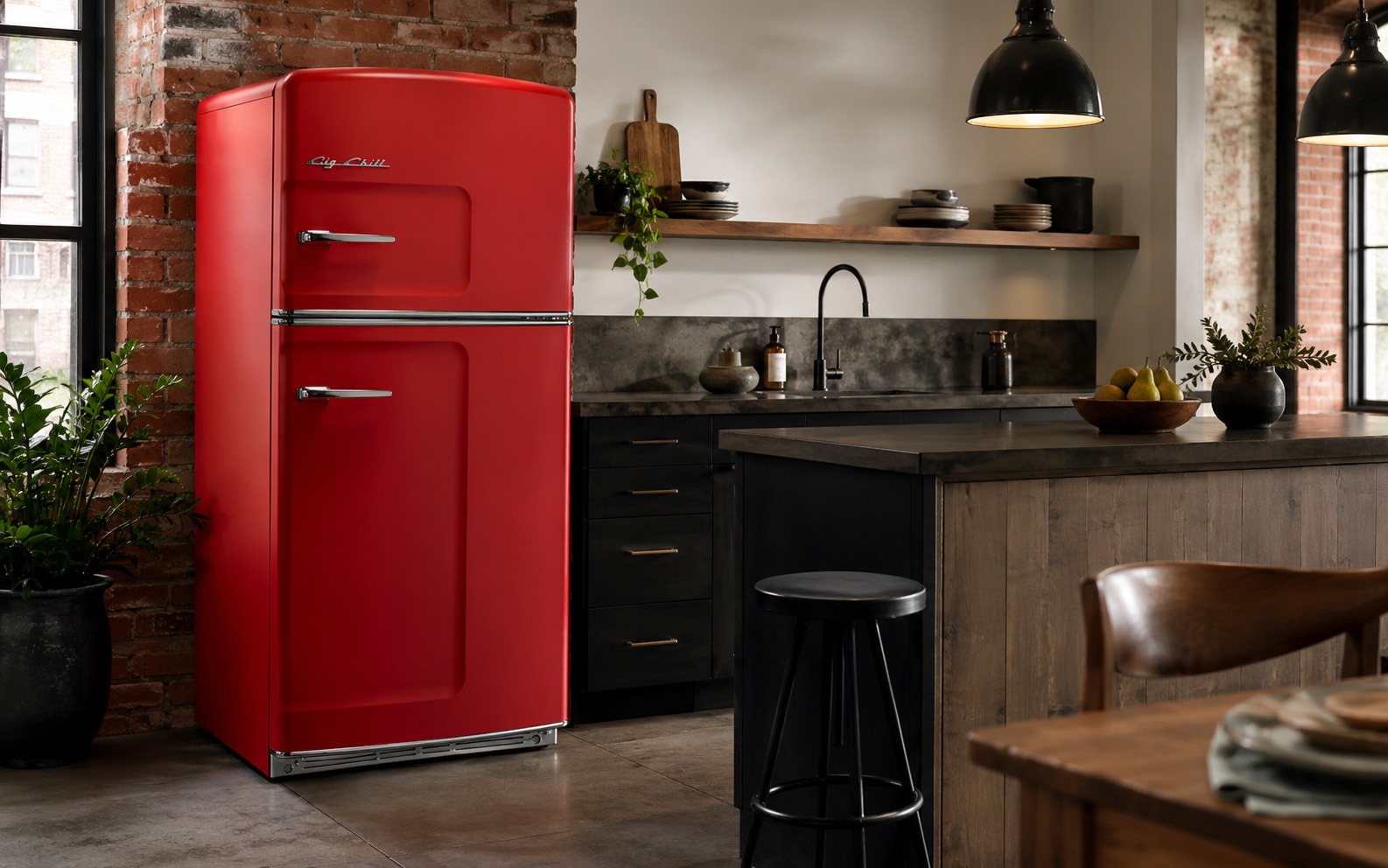
Approximate digital color: #C22B31
Cherry Red is the most assertive of the seven standard colors. It reads as confident, graphic, and clearly retro.
You won’t miss a Cherry Red appliance! The color rarely disappears into a room. That makes it well-suited to kitchens that need one strong focal point. It can provide color without requiring patterned cabinets, elaborate tile, or multiple competing decorative features.
Home styles that suit Cherry Red
Cherry Red can work in:
- Midcentury kitchens
- Urban lofts
- Industrial interiors
- Contemporary kitchens
- Traditional homes with dark wood
- Rustic lodges
- Game rooms and entertainment areas
- Vacation properties
- Eclectic suburban homes
In a modern white kitchen, it becomes a sculptural statement. Against reclaimed wood or stone, it takes on a more rugged character. In a loft, it works comfortably with exposed brick, steel, and concrete.
Cabinets and wood
Cherry Red pairs well with walnut, ebonized oak, charcoal cabinetry, white oak, natural maple, cream paint, and black finishes.
Walnut creates a rich, mature combination. White or pale cabinets make the color appear cleaner and brighter. Dark cabinets produce a dramatic effect.
Counters and stone
Consider:
- Black or dark gray soapstone
- Basalt
- Concrete
- White quartz
- Pale terrazzo
- Carrara-style marble
- Brick or terracotta accents
Dark counters make the appliance feel substantial. Pale counters keep it from becoming visually heavy.
Metals
Chrome produces the strongest 1950s reference. Polished nickel offers a similar effect with slightly less contrast. Blackened steel and matte black move the color toward industrial or rustic design.
Lighting
Red becomes deeper under warm lighting and brighter under strong neutral light. Use accurate task lighting near the range so food colors remain easy to judge.
4. Classic White
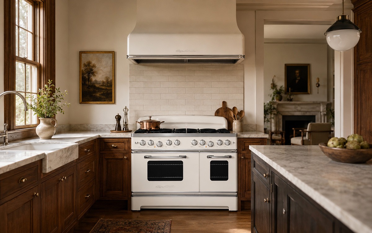
Approximate digital color: #F5F5F2
Classic White is the most adaptable of the standard Big Chill colors. It allows the appliance’s rounded body, chrome hardware, and retro profile to provide interest rather than relying on a bold finish.
White does not always make an appliance disappear. Quite the opposite. A curved white refrigerator can still stand apart from flat cabinetry and angular contemporary appliances.
Home styles that suit Classic White
Classic White can work in almost any setting, including:
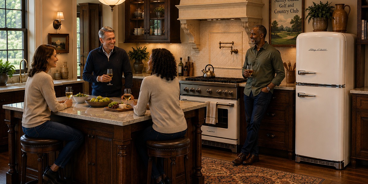
- Traditional homes
- Historic residences
- Farmhouses
- Coastal houses
- Contemporary kitchens
- Transitional suburban homes
- Craftsman houses
- Cabins
- Small apartments and condominiums
It is also a practical choice when the room already contains strong wood grain, colorful cabinets, patterned tile, or dramatic stone.
Cabinets and wood
Classic White works with nearly any wood species or painted finish.
It looks particularly strong with walnut, character hickory, knotty alder, white oak, navy cabinets, dark green paint, natural maple, and black cabinetry.
White-on-white can also work, but the undertones should be compared carefully. A cool cabinet white beside a warmer appliance white may make one of them appear yellowed or blue.
Counters and stone
Classic White pairs with:
- Soapstone
- Marble
- Quartzite
- Granite
- Concrete
- Slate
- Butcher block
- Terrazzo
- River-rock and aggregate surfaces
Because the appliance is neutral, the counter or backsplash can carry more patterns.
Metals
Chrome and nickel support the classic appliance design. Matte black makes the room more contemporary. Brass introduces warmth and can connect the appliance to traditional lighting or cabinet hardware.
Lighting
Cool LEDs can give white appliances a blue cast. Warmer lighting usually produces a more comfortable effect, particularly in rooms with wood cabinets and floors.
5. Jadite Green
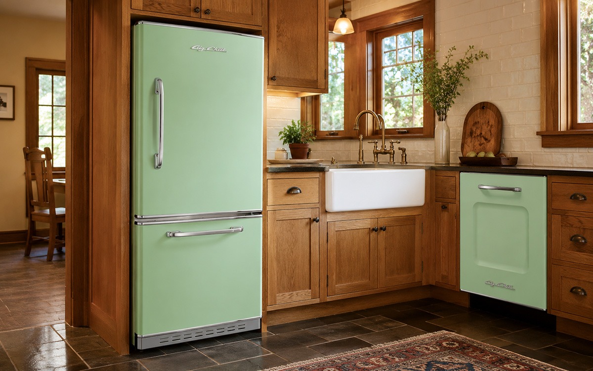
Approximate digital color: #7DC39B
Jadite Green takes its name from the pale green glassware associated with American kitchens of the early and mid-20th century. It feels historical without appearing formal.
The color has enough gray and softness to work with natural materials, but it remains distinct enough to serve as a focal point.
Home styles that suit Jadite Green
Jadite works especially well in:
- Farmhouses
- Craftsman homes
- Traditional cottages
- Bungalows
- Midcentury kitchens
- Historic houses
- Nature-oriented contemporary homes
- Mountain residences
- English- and European-influenced kitchens
It fits naturally into rooms that already use botanical colors, handmade tile, painted furniture, or visible wood grain.
Cabinets and wood
Jadite Green complements quarter-sawn white oak, walnut, reclaimed wood, chestnut-toned finishes, maple, natural pine, and gray-washed wood.
It also pairs well with cream, warm white, charcoal, navy, and dark green cabinets.
Using green cabinets with a green appliance can work, but the shades need enough contrast to prevent the room from looking like an approximate color match.
Counters and stone
Consider:
- Slate
- Soapstone
- Honed limestone
- Dark granite
- Cream quartzite
- White marble
- Warm concrete
- Tile with moss, brown, blue, or cream tones
Metals
Brushed brass, antiqued brass, weathered copper, and bronze emphasize the historic side of Jadite Green. Chrome and nickel make it feel cleaner and more midcentury.
Lighting
North-facing daylight can make Jadite Green appear cooler and closer to mint. Warm ambient lighting helps preserve its softer, earthier quality.
6. Pink Lemonade
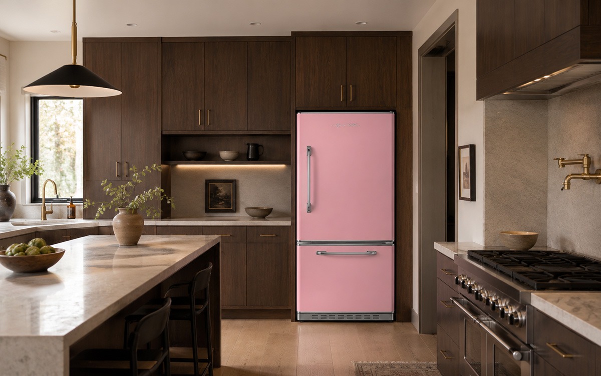
Home styles that suit Pink Lemonade
Pink Lemonade can work in:- Mid-century homes
- Art Deco-influenced interiors
- Contemporary kitchens
- Coastal cottages
- Eclectic houses
- Historic apartments
- Vacation homes
- Dark timber or stone kitchens need a softer contrast
Cabinets and wood
Pink Lemonade pairs well with walnut, dark-stained oak, black ash, white oak, cream paint, charcoal, dark green, and muted blue. Natural walnut is especially effective because its brown and reddish undertones connect with the pink without matching it.Counters and stone
Consider:- Greige quartzite
- Honed limestone
- Warm concrete
- Pale terrazzo
- Soapstone
- Marble with gray or warm veining
- Cream quartz
- Dark granite
Metals
Brushed nickel keeps the room restrained. Chrome gives the color a stronger retro association. Aged brass adds warmth, while matte black creates a sharper contemporary contrast.Lighting
Strong daylight can wash out pale pink. Layered ambient, pendant, and under-cabinet lighting will help the finish retain its color throughout the day.7. Turquoise
Approximate digital color: #30C5C7
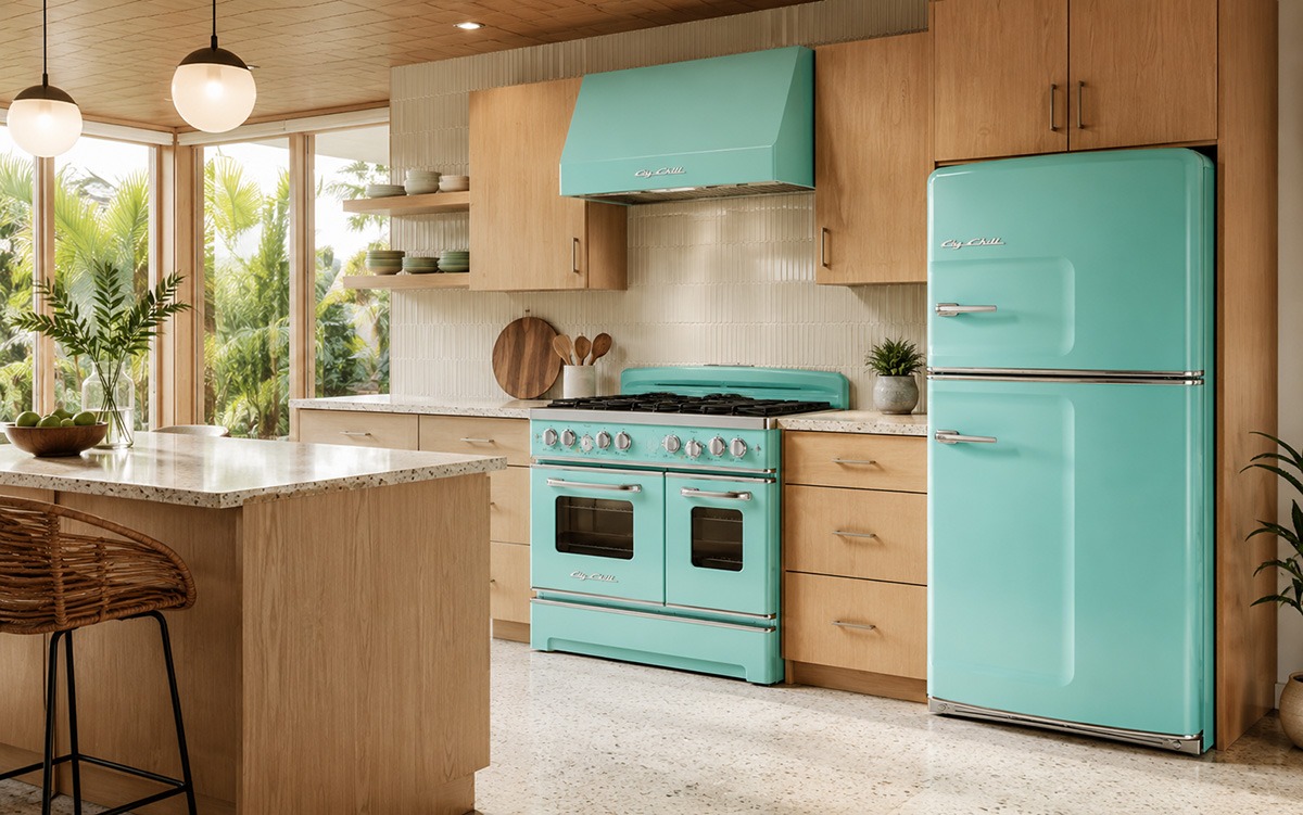
Turquoise is brighter and more energetic than Beach Blue. It evokes vintage enamelware, midcentury kitchens, Southwestern color, swimming pools, coastal water, and 1950s automobiles.
It is bold without being a primary color, making it easier to combine with wood, cream, gray, and black.
Home styles that suit Turquoise
Turquoise can work in:
- Mid-century modern homes
- Coastal houses
- Southwestern interiors
- Contemporary kitchens
- Urban lofts
- Vacation properties
- Pool houses and entertainment spaces
- Rustic homes with neutral materials
- Transitional kitchens that need a stronger identity
It can become a bright statement in a neutral room or join a wider palette of blues, greens, and natural finishes.
Cabinets and wood
Turquoise pairs well with natural oak, rift-cut white oak, walnut, honey-toned pine, cream paint, mushroom-colored cabinets, charcoal, and matte black.
It also works with white cabinets, though the result will appear brighter and more clearly retro.
Counters and stone
Consider:
- Gray soapstone
- Carrara-style marble
- White quartzite
- Concrete
- Pale terrazzo
- Black granite
- Slate
- Light quartz
Metals
Chrome produces a period-influenced appearance. Matte black pushes Turquoise toward contemporary design. Nickel and stainless finishes can create a cleaner transition between the appliance and other modern equipment.
Lighting
Turquoise changes noticeably with color temperature. Cool lighting emphasizes the blue. Warm lighting brings out more green. Test the finish under the actual kitchen lighting rather than relying on a showroom or computer screen.
Choosing a Big Chill color based on home style
The architecture does not dictate a single correct appliance color. It can, however, help narrow the choices.
Traditional and historic homes
Farmhouses and cottages
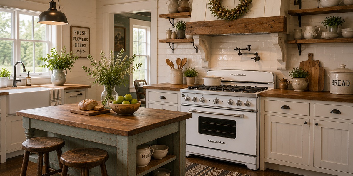
Buttercup Yellow, Jadite Green, Classic White, and Beach Blue work naturally with apron sinks, wood counters, open shelving, painted cabinetry, and handmade surfaces.
The appliance can carry the character without relying on artificial distressing or decorative signs.
Mid-century homes
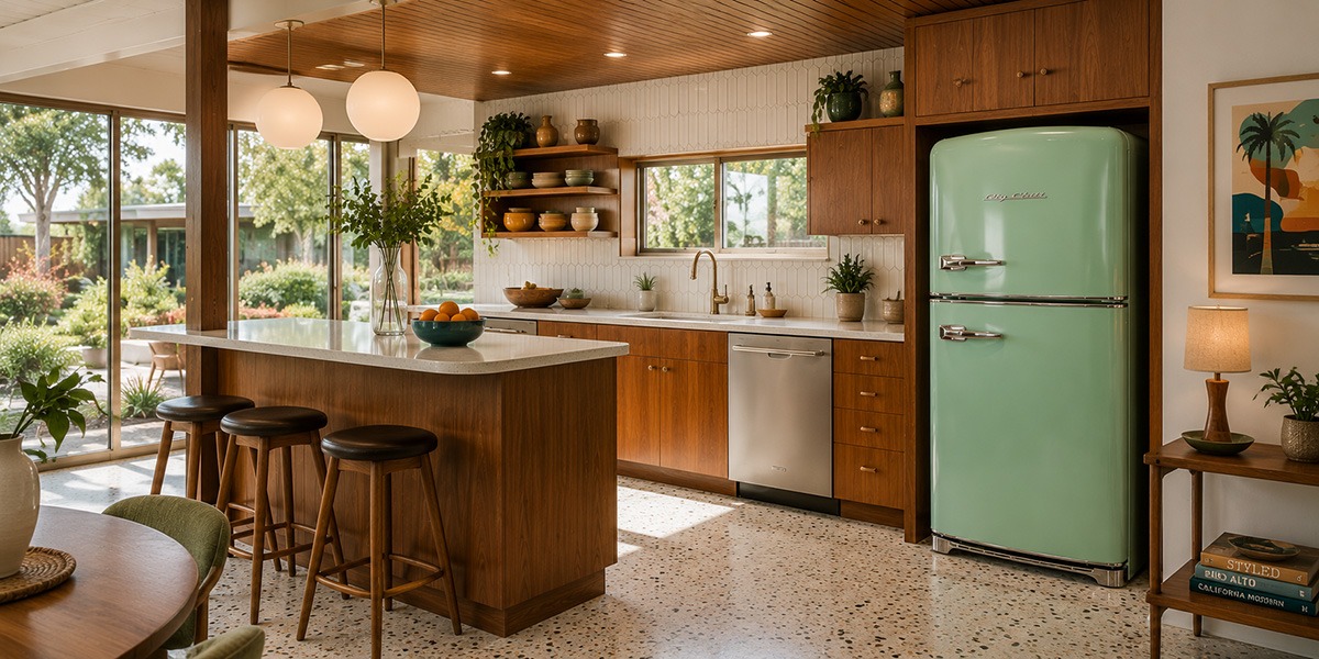
Jadite Green, Turquoise, Pink Lemonade, Buttercup Yellow, and Cherry Red all have clear midcentury associations.
The most successful rooms often use one strong appliance color while keeping the cabinets, flooring, and surrounding furnishings more restrained.
Contemporary homes
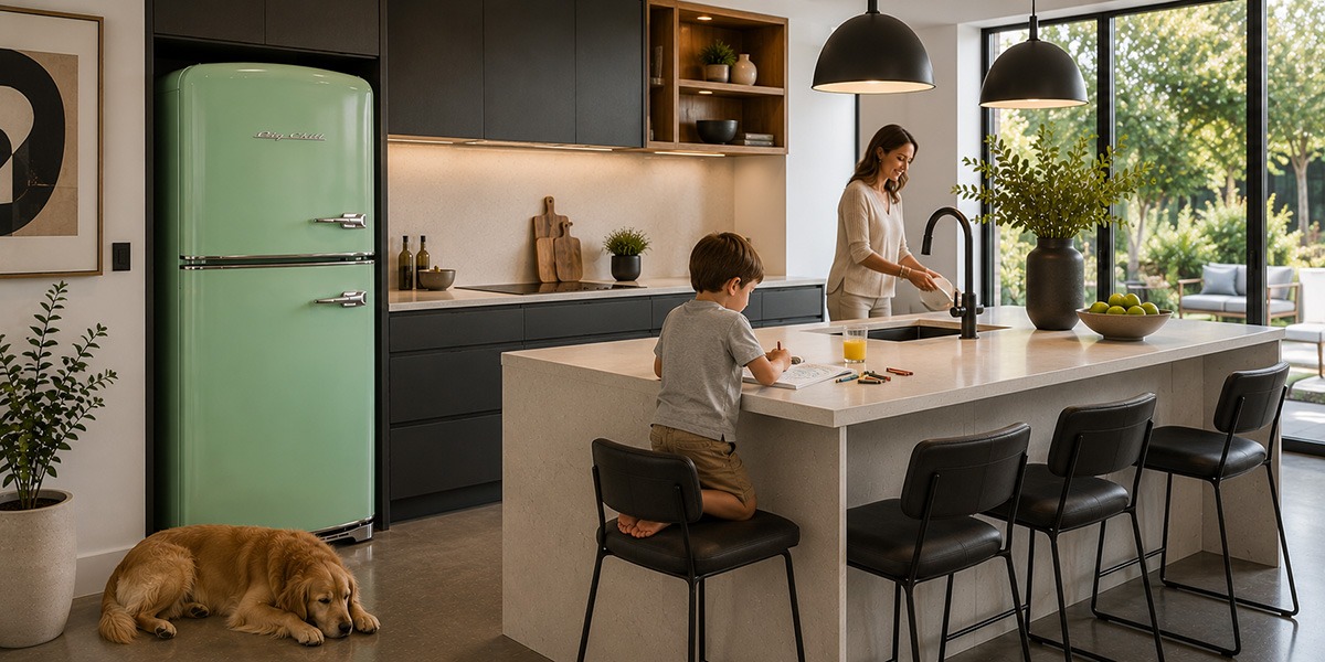
Cherry Red, Turquoise, Beach Blue, Pink Lemonade, and Classic White can interrupt a room dominated by straight lines and flat surfaces.
In this setting, the retro appliance works through contrast. It does not need to match the architecture to belong in the room.
Coastal homes
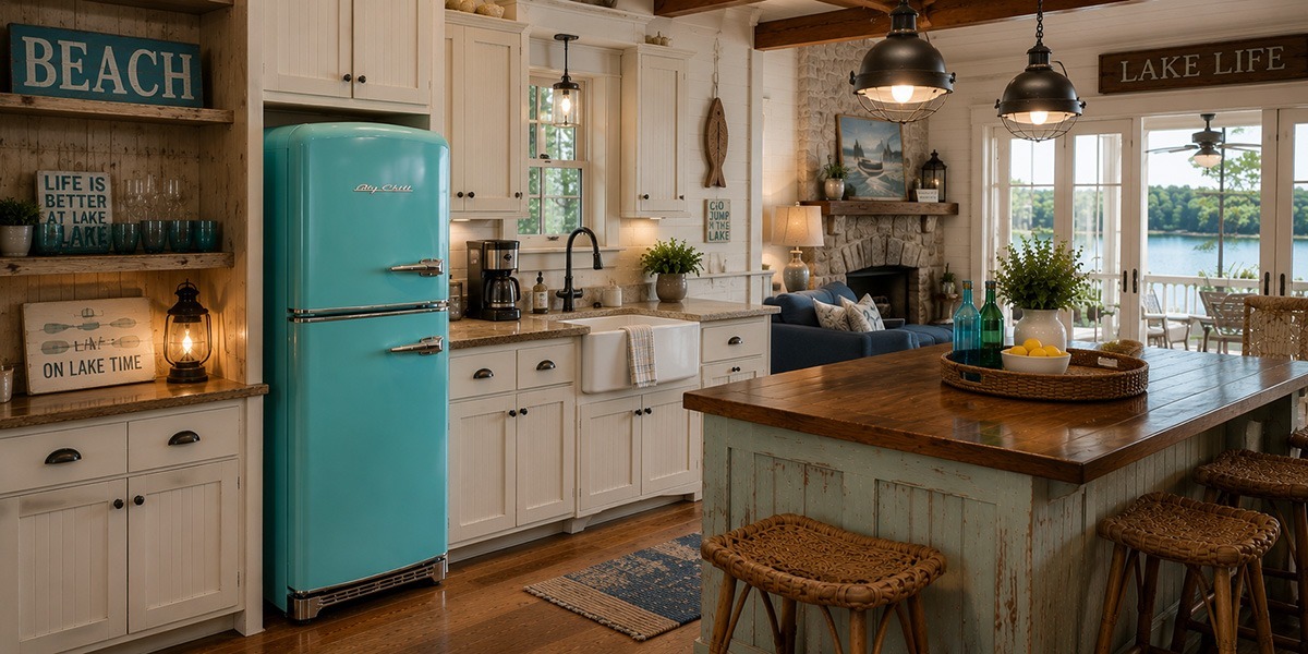
Beach Blue, Turquoise, Classic White, and Pink Lemonade pair well with light woods, white cabinetry, natural fibers, and relaxed interiors.
A coastal kitchen does not need literal beach-themed decoration. Color alone can establish the connection.
Urban and industrial interiors
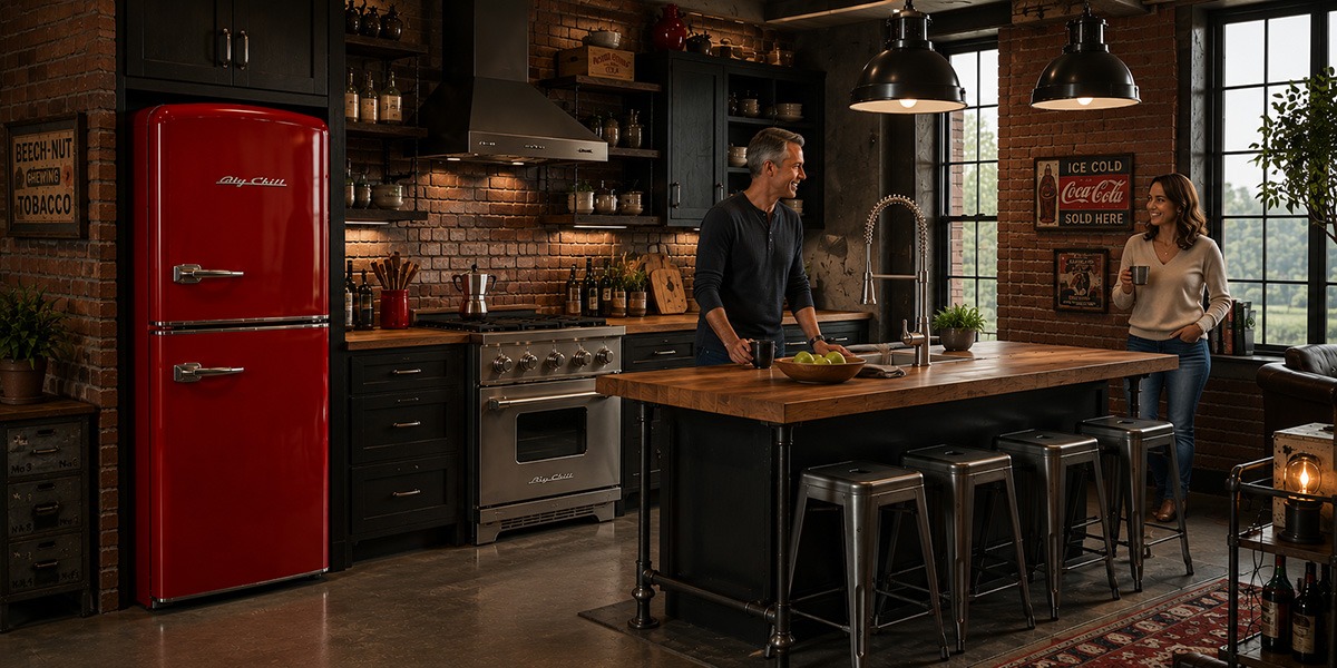
Cherry Red, Turquoise, and Classic White work well against brick, concrete, steel, dark cabinetry, and open architecture.
The rounded appliance body softens the room without concealing its industrial character.
Cabins and rustic homes
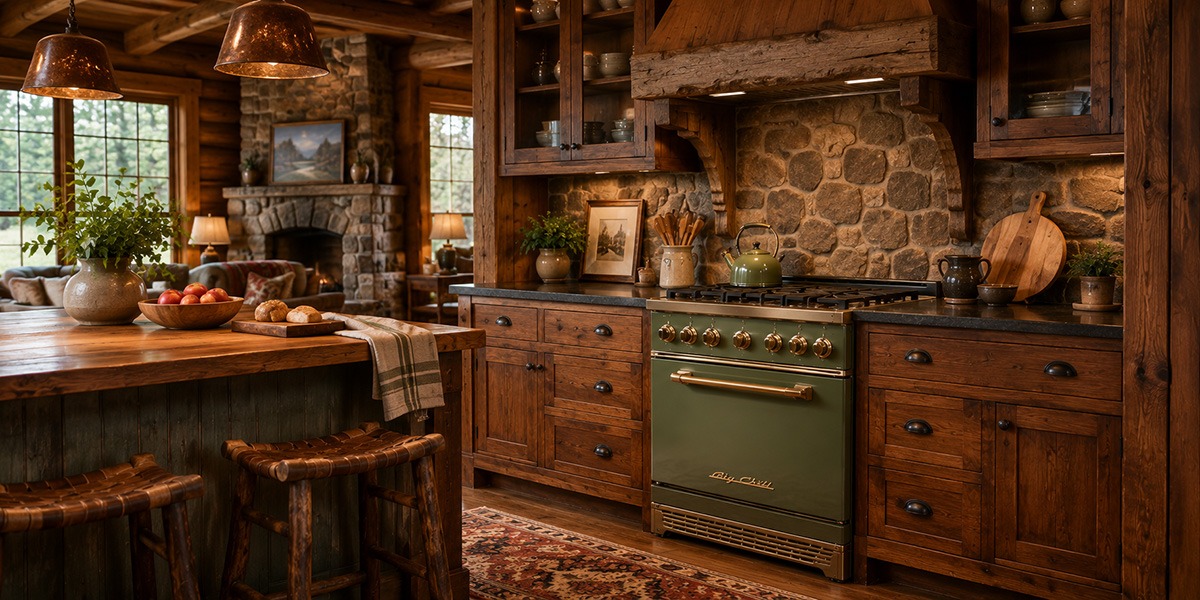
Choose between a focal point and a complete appliance suite
Kitchen Obsession offers Big Chill Retro colors in refrigerators, ranges, hoods, cooktops, wall ovens, dishwashers, microwaves, and selected small appliances. Availability varies by product. That creates two basic design approaches.Use one colored appliance as the focal point
The design and color of our Big Chill appliances can have a visual punch. A single refrigerator or range can carry the room. This works well when the kitchen already contains stainless steel, integrated appliances, or neutral finishes. The statement appliance should have enough visual space around it to be appreciated.Coordinate several appliances
When combined, a refrigerator, range, hood, and dishwasher in the same finish can create a more cohesive design statement. This approach works best when the surrounding cabinets and surfaces play a supporting role. If they are too visually stimulating or feature too many additional colors and patterns, they can compete or, worse, clash with the appliance suite.Think about undertones, not only color names
Colors that seem compatible on a screen may contain different undertones in person. A cabinet white may be blue, gray, yellow, or pink. A wood stain might look an unremarkable brown on its own, but might lean red, orange, gray, or green when placed next to a visually dominant appliance. Stone may contain small color variations and undertones that become more noticeable beside a large painted appliance. Place the physical appliance sample beside:- A cabinet door
- The selected countertop
- The backsplash tile
- Flooring
- Metal hardware
- Wall paint
Repeat the appliance color with restraint
A colored appliance usually looks more integrated when its finish appears somewhere else in the room. One or two small references may be enough. Consider repeating the color in:- Artwork
- Upholstery
- A tile detail
- Cookware
- A painted cabinet interior
- A nearby rug
- Window treatments
- Dinnerware displayed behind glass
See the colors in a complete kitchen
Colors may look or feel different in person. Cabinet finishes, countertops, flooring, window direction, and artificial lighting can all change how the color reads. Explore the Big Chill Retro Collection, compare the available Retro refrigerators, and review the coordinating Retro stove collection. You can also visit the Kitchen Obsession showroom or contact us for help comparing colors, appliance sizes, and product combinations for your home. The right choice is the color that makes sense beside the materials, lighting, architecture, and furnishings already defining the room.Bibliography
- Kitchen Obsession, 30-Inch Big Chill Retro Induction Stove
- Kitchen Obsession, Big Chill Retropolitan Refrigerator
- Kitchen Obsession, Big Chill Retro Original Refrigerator
- Kitchen Obsession, Big Chill Retro Dishwasher
- Kitchen Obsession, Big Chill Retro Microwave
- Kitchen Obsession, Big Chill, 28-Inch Retro Studio Refrigerator
- Big Chill, Color Samples
- Big Chill, Retro Color Swatches
